At a closer look:
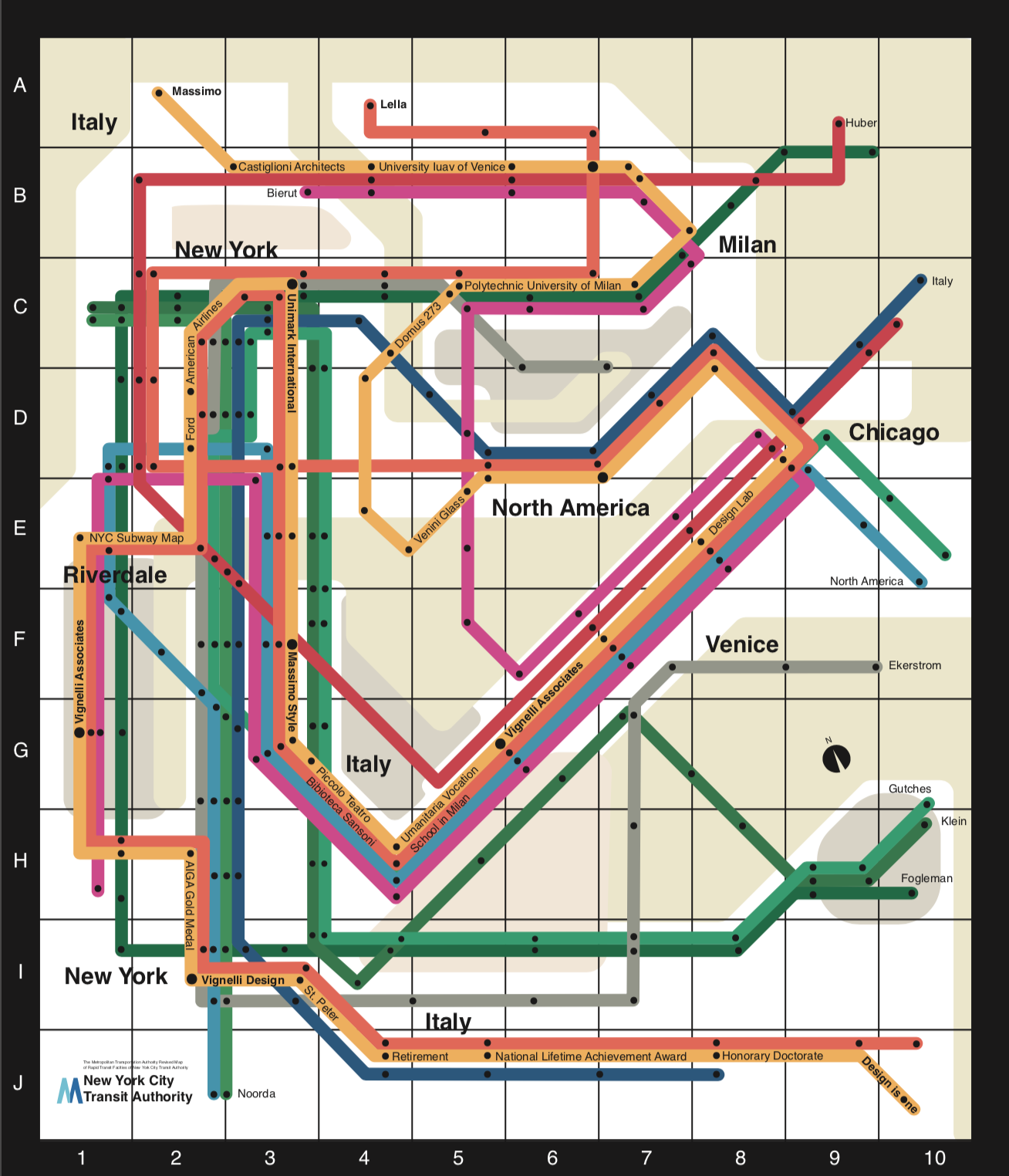
I created a timeline of Massimo’s life in the form of the New York Subway Map. This was an obvious choice considering that it was one of Massimo’s more well-known designs. I stayed within his guidelines of 90 and 45-degree angles, consistent color scheme and the easy decision of Helvetica for the typeface. If you follow the Orange Line, labeled “Massimo”, that starts at the top left and weaves itself all the way to the bottom right, you may realize that this illustrates the flow of his life, where he was when and who he was with. The other “lines” (people) of the map converge with the Orange line when they converged with Massimo in real life. You may also notice the location changes as you move about and this corresponds to where he was at what point in his life and with whom.
On the back:
Part of the challenge within this design was incorporating an essay about Massimo and Lella Vignelli. I was able to utilize the back of the map to do so. If you care to read the article I wrote, you may do so here. Massimo is One.


